We present this article from Charles Barry as a potential third method for allocating votes to Parliamentary seats in the upcoming United Kingdom elections. An extensive discussion of the two more common ways — uniform swing and proportional swing (upon which the 538 model is based), can be found here.
by Charles Barry
When pollsters and journalists want to project the outcome of the UK election from the latest polls, they prefer to use the Uniform National Swing (UNS) model. In this article, I’d like to present an entirely different way of doing things.
I don’t blame them for using UNS. Up until about 1987 UNS had projected virtually every election with astounding accuracy. Furthermore, it was simple to set up and use and could provide objective results quickly. Best of all, on election night, the broadcasters could look at the first results to come in, examine the swing from Labour to Conservative or vice versa and then provide an accurate forecast of the whole election, allowing those who didn’t fancy staying up till 3 in the morning an opportunity to see who was going to be their Prime Minister when they woke up. But over time, and with the rise of third parties, the UNS model has become less and less accurate.
So how does my model work? Simply put, it looks at past general elections and determines – mathematically – the ‘character’ of each constituency, for instance whether it is marginal, safe, volatile, stable and so on. It looks at the relationship in each constituency between national vote share and the local constituency vote shares.
To phrase this a bit more mathematically, we assume that there is a function that relates the independent variable x (national vote share) to the dependent variable y (constituency vote share). What is this function? After some consideration, I decided to use the Cumulative Kumaraswamy distribution which looks like this:

…where y is constituency vote share, x is national vote share and A and B are mathematically determined constants. (NB while this is actually a cumulative probability distribution, I am not using it to model probabilities)
So why did I choose this formula? Firstly, it is incredibly flexible and not particularly difficult to use, allowing it to simulate a variety of electoral scenarios, which I shall demonstrate below. Secondly, it doesn’t come up with stupid results such as “Party A gets 13% of the votes in the constituency despite receiving 0% nationally”. Thirdly, it doesn’t assume that swing behaves in a constant fashion – in most cases, it can model swing in a non-linear fashion. More on this below.
To determine what values A and B take, we use an optimisation routine called the BFGS method; effectively we let the computer hone in on what values produce the curve most likely to model the election results, as implied by the results of the previous four general elections.
My model simulates the seats according to which region in the UK the seat lies – in England, I produce three equations of the type above to model the Conservatives, Labour and the Lib Dems. For Scotland, I also have an equation for the Scottish National Party and in Wales I have an equation for Plaid Cymru. I use national polling data for English seats, Scottish polling data for Scotland and Welsh polling data for Wales. In Northern Ireland, I simply don’t bother trying to perform a simulation, because opinion polling is non-existent. This is a shame, because at this election Northern Ireland may prove crucial as to whether the Conservatives get an overall majority. (The more seats Sinn Fein or the UUP get, the less well off the Conservatives.)
Finally, we can aggregate the results from these 3000 or so unique equations into a general election result. I also introduce errors and then repeatedly simulate the result so I can get a probabilistic forecast as well.
So what about those curves I was mentioning before? I have produced two sample charts which show how the model develops different scenarios for different seats. In all the following charts, the red curve models Labour, blue models Conservative and yellow models the Lib Dems. The horizontal axis is the national vote share for that party, and the vertical axis is the constituency vote share. (The large vertical lines at 100 on the graph are meaningless and simply reflect EXCEL tripping over itself.)
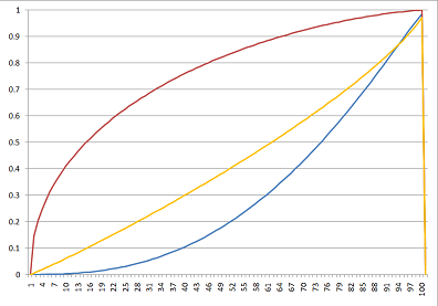
The diagram above shows a very safe Labour seat: Liverpool Walton. You won’t be surprised to learn that in 2005 the Labour party won this seat with just over 72% of the votes in the constituency – a remarkable result considering that they got roughly half that number of votes nationally. For the Conservative party to take this seat they would need to have a lead in the national polls of over 50%.
Going back to what I was saying about non-linear swing, from 0% to about 30%, we can see that Labour get a greater swing than would be expected on a linear swing, while beyond that point Labour get less than would be expected on a linear swing. The reverse is roughly true for the Lib Dems and Conservatives.
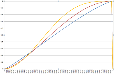
Above is Bedford, and it is most definitely not a safe seat! In fact, Bedford is one of the most interesting seats in the upcoming election because it is one of the “M1 Truels” (a truel is a three way duel, as fans of game theory and The Good, The Bad and The Ugly will note). Any of the three main parties could win this seat.
You will note the curves in this seat are much more like straight lines, and the swing in the centre (20% to 50% national votes) is linear. This is why UNS earned its spurs –- quite a lot of seats have linear swings. But you’ll also note that the Lib Dem curve is steeper – which is why they can move from third place to first place in the constituency result, while still staying in third place in share of national votes.
So enough of the fancy charts – let’s get down to business. Let’s look at the predictions. Although, as I said earlier, my forecast model is probabilistic, those distributions take a long time to calculate so I’m going to remove the randomness and look at the central predictions instead.
The weekend polls are just out, so we can compare what would happen under different pollster’s results.
YouGov, ICM and BPIX have all published similar results, with an average of 34.6% Conservative, 27.6% Labour and 28.2% Lib Dem. This is the prediction under those numbers, as compared with the same under UNS:
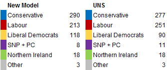
AngusReid have published a poll which shows drastically lower levels of support for Labour, at 35% Conservative, 23% Labour and 29% Liberal Democrat. If this were accurate, this is the result:
The Tories are only 6 seats short of an overall majority, and they could be just over the line, depending on the results in Northern Ireland. Labour under my model is facing destruction as a party in England. Note also the much higher support for others in the New Model.
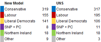
Finally, ComRes have published a poll showing the Tories with a runaway lead, and a lower level of support for the Lib Dems, at 38% Conservative, 28% Labour, 25% Lib Dems. Here is the result under their numbers:

If this situation were true, under my model you would already hear the champagne bottles popping at Conservative HQ. Regardless of the situation in Northern Ireland, they would have a comfortable majority sufficient to govern as a single party.
I want to end with a quick discussion of the drawbacks of this model. There are many potential problems with this model, and I highlight many of them in the explanation on my website. For now, I just want to deal with the most important.
The main problem with this simulator is that it only uses data from the four previous general elections. Statistically speaking, this is a very small sample size and we cannot be sure in any way that in the coming election the seats will behave anything like I have predicted. The upcoming election could be a significant deviation from past trends and so there is this inherent uncertainty in the predictions of the model.
However, in my defence, I estimated the average mean error of all 3000 equations by comparing the predictions of the model to past general election results – and it came to only 2.15%. 60% of all the estimations were able to produce a general election result to within 1% of their actual value, and an additional 27% were accurate to within 2.5% of the actual result. Only 2% of all equations were unable to produce a reliable value. And when I use a probabilistic forecast, these errors can be accounted for.
The other main problem with this model is that it requires a “track record” of the seat to be able to “learn” what its characteristics are. The 2010 boundary changes have abolished 9 seats and created 13 new ones and I simply do not have enough data to predict these new ones properly – so I have to rely on simple old UNS for these seats. Additionally, there were substantial changes to the boundaries in Scotland in 2005, and some of the seats I forecast did not exist in 1992, meaning that their track record is also not as accurate as other seats.
However on the whole, I feel that my model could provide a refreshing –- and perhaps more accurate — alternative to UNS.
You can download the model for yourself here (Excel 2007 format), and I provide detailed probabilistic forecasts on my website.
Charles Barry is a UK student with an interest in economics, politics and finance. He blogs intermittently at http://charlesbarry.wordpress.com and tweets more frequently at http://twitter.com/charlesbarry