Last week we learned that the housing market was doing poorly, largely because of the expiration of the new home buyers tax credit. As such, it seems appropriate to take a look at the housing market to see if its condition is improving or deteriorating. All of the charts used are from the blog Calculated Risk.
First, let’s look at the existing home sales market. This is by far the largest of the two housing markets. Click on all graphs for a larger image.
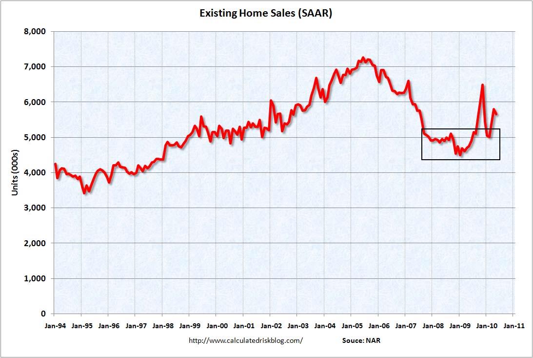 The pace of home sales bottomed in early 2008. It has spiked from that level several times, but seems to gravitate to the 5,000,000/year level.
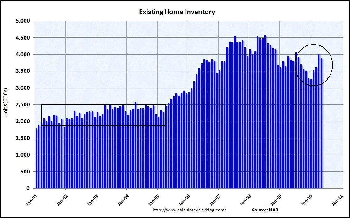
Total inventory of available homes is still horribly out of line with the historical norms of the early 2000s.
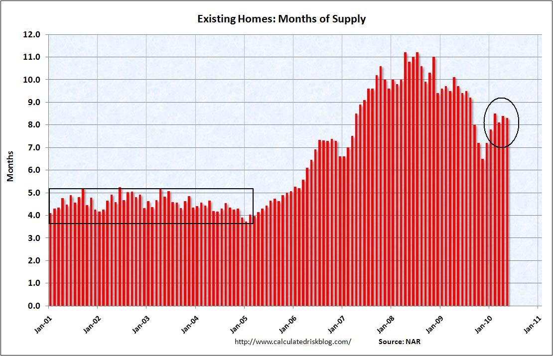 The housing market measures sales by a “how long would it take to clear current inventory at the current sales pace” measurement. As with the total inventory figure, that number is still very high and indicates the market is far from setting an equilibrium price.
Now let’s turn to the new homes market.
 The pace of new home sales hit a record low last month.
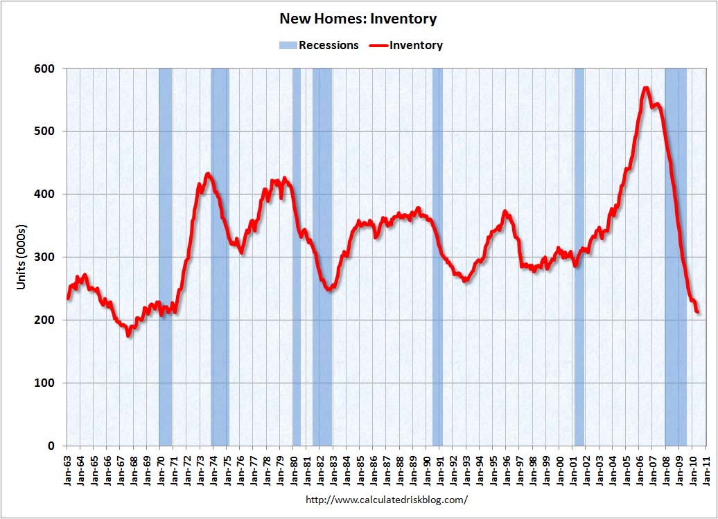 Unlike the existing home sales market, the inventory of available homes is near historical lows.
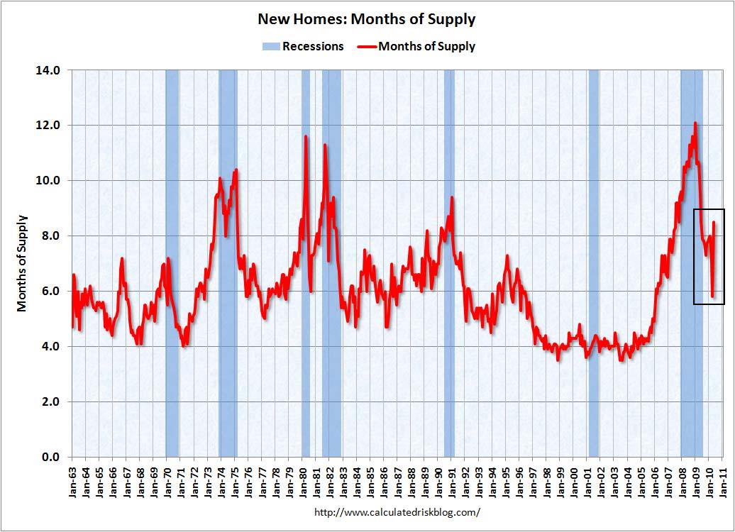
The inventory available for sales figures was at a low level until last month when it spiked higher.
What does all this mean?
1.) The existing home sales market has farther to fall. There is simply far too much inventory on the market for prices to remain stable.
2.) During the recession, the economy lost a total of 7,281,000 million jobs. Of these, 2,102,000 or 28% were construction workers. Given the massive inventory overhang in the existing home sales market it is highly doubtful that we’ll see large construction employment gains in the near future.
3.) Housing wealth is one determinant of consumer behavior. If housing prices continue to move lower, expect lower consumer spending to follow.